(Spoilers for the ending of The Invincible and a late-game scene from Cyberpunk 2077)
As I played through The Invincible, I couldn’t help but feel that the developers were fixated on telling a particular story, but weren’t concerned with the medium by which to tell it, and only ended up making a videogame because that happened to be the business they were in.
The Invincible is a prequel to the hard science fiction novel of the same name by Stanislaw Lem. Both the game and the novel concern themselves with the discovery of alien robotic life on a faraway planet. In the game, you play as Yasna, a biologist on an expedition to an alien planet who is stranded from her comrades after a mysterious accident. The game can broadly be described as a first person narrative adventure. Players explore the planet (albeit in a mostly linear manner) as Yasna in hopes of reuniting with her comrades and discovering the secrets of this planet.
As a story, The Invincible is compelling enough (largely owing to Stanislaw Lem’s rich imagination and adherence to fundamental scientific principles) but as a game, it’s rather dull. Much of the game consists of trudging through barren planetary landscapes without a sense of danger, there are no risks of death or survival mechanics of any sort. Besides that, the game’s greatest sin is that it slavishly adheres to its first person perspective (even during cutscenes) without really considering how to use the first person perspective in engaging and interesting ways.
Consider the above cutscene. Early in the game, Yasna has frequent flashbacks to mission briefings with her commander back onboard the spaceship she arrived in. These cutscenes are largely non-interactive and play out entirely in first person. We watch as the other characters deliver dense and long expedition (which really could do with an editor) while everyone involved remains largely stationary.
In a conventional cutscene with a non-diegetic camera perspective, what the camera focuses on and what it doesn’t tells the viewer what is important information. Is the information conveyed in a line of dialogue important? Or maybe its a character’s emotional reaction to that information? Is there tension between the characters, or are they relaxed around each other?
Throughout this scene we never deviate from Yasna’s perspective and also have free control of where she looks. The game gives us a great deal of exposition and environmental information in the scene, but none of it is highlighted (or ignored) by designer driven shot choices. We can pay attention to anything or nothing (which, to be clear, is a great choice for a game about observation like Spyparty) and it becomes incredibly easy to lose focus on the pertinent exposition being given. We also have no information about Yasna’s emotional state. Does she look around nervously? Does she pace back and forth in excitement? None of this is conveyed and the entire cutscene ends up incredibly dull.
This misuse of the first person perspective is a great shame as just a few years prior to The Invincible’s release, another game was released that told its story entirely in the first person and did it exceptionally well: Cyberpunk 2077.
At the heart of it, Cyberpunk 2077’s story is an intimate one. It’s about V’s failed attempt to realize his/her ambitions and his/her confrontation with their mortality. When we see Night City through V’s eyes, we inhabit his/her perspective quite vividly. V has a physical body that other characters interact with, when they hug him/her, or punch him/her, we as players witness these interactions in the first person and thus we feel these moments more intensely. Unlike The Invincible, Cyberpunk is cognizant of the fact that the first person camera is not just a floating disembodied camera. There’s a body attached to it and this body feels the world and the people around it.
Furthermore, Cyberpunk does not use the first person perspective as an excuse to not have interesting shot compositions and motivated camera movements. When V travels to the Night City oil fields to find Johnny Silverhand’s grave, he/she sits there with the ghost of Johnny. We see Johnny, shrunken and small, juxtaposed with the dirty industrial oil fields and we recognize him for what he is: the detritus of an old world. In Cyberpunk, conversations and cutscenes are rarely static. Characters move and pace and wander as they talk, conveying information about their emotional states and changing the visual composition of the scene.
All of this takes a lot of work as the developers can attest to (here is a great interview in which the developers talk about the unique challenges of first person storytelling) and it no doubt took a great deal of time and resources which the smaller indie team behind The Invincible probably can’t afford, which just suggests that this design choice may have been a mistake. If they do not have the resources to more vividly animate whole scenes with multiple characters, perhaps a non-diegetic camera where the designer can choose what to show or not show might have been the better choice.
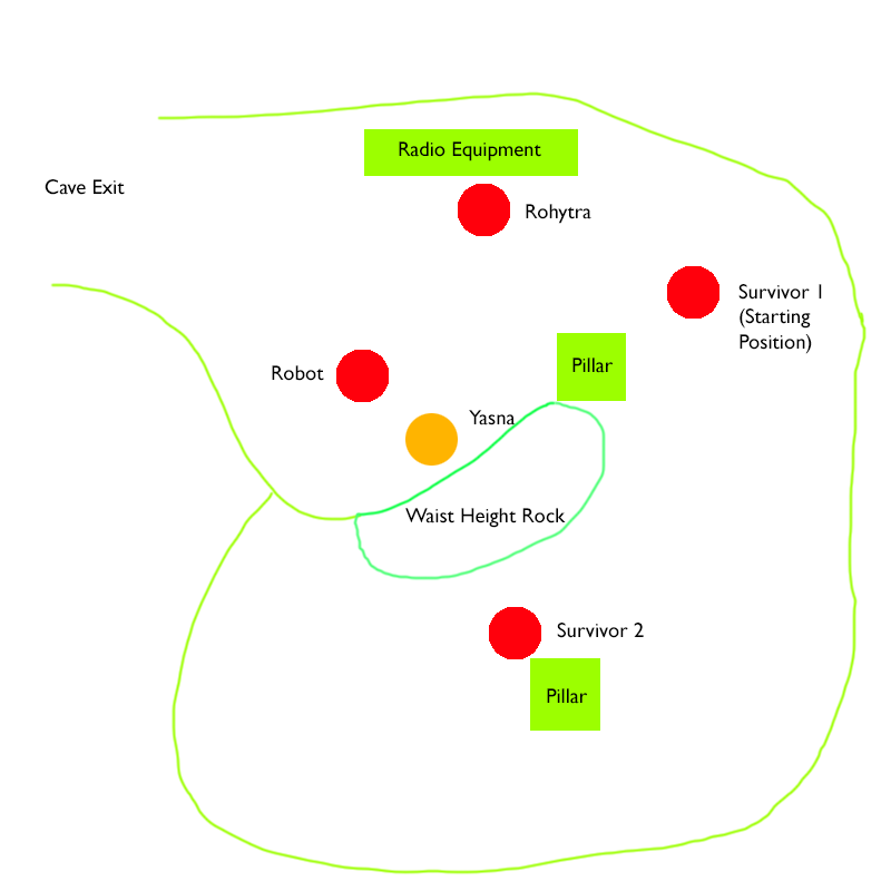
That said, using the first person perspective in compelling ways is still possible even with limited resources. There’s one scene in The Invincible that uses its perspective quite well in fact. Late in the game, Yasna is captured by a surviving member of another expedition by an enemy faction. The survivor, Rohytra, leads her to a cave where he and two other survivors have been camping out in the hopes of getting rescued. Inside the cave, Yasna must convince Rohytra that she means no harm and that they should work together to better their odds of survival.
The layout of the characters in this scene is quite interesting. Yasna is seated on a rock with Rohytra in front of her at a distance, and his robot looming over her on the left. Surrounding her are Rohytra’s two fellow survivors. The player is free to look around and in doing so would notice they are surrounded on all sides. Yasna is not safe and there is no escape. Rohytra’s comrades are mentally unwell (and he himself isn’t much better). Potential dangers surround Yasna. To get out of this rut, Yasna has to convince Rohytra that they should work together and to do so she’d have to calm him down. As the player you do this by looking around you, at the other survivors, at the tools and equipment in their makeshift home, at Rohytra himself, in the attempt to find things to converse with him about.

Alas, this is perhaps the only scene in the game which makes good use of the first person perspective. Disappointingly, the poorest use of the first person perspective comes from the game’s final scene.
At the end of the game, Rohytra has successfully travelled to the spaceship his expedition arrived in. Traumatized by the deaths of his comrades, he endeavors to use the spaceship’s nuclear warheads to bomb the habitats of the alien robotic life that live on this planet. It’s up to Yasna to try and convince him not to do so.
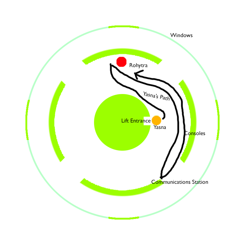
The scene begins with Yasna first arriving on the bridge of the spaceship via the elevator. Rohytra calls out to her and Yasna walks over. Rohytra then attempts to use a smaller bomb to exterminate the alien robots, but the bomb fails. In response, Yasna walks over to the communications station to contact her commander on her expedition’s spaceship in the hopes of getting them both rescued. She then walks back to Rohytra, who has decided to use the nuclear warheads. She must now convince him to stand down, with the aid of her commander over the radio.
If the scene sounds quite tedious from my description, that’s because it is! It’s as if, in an earlier iteration of this scene, the developers noticed how boring it is to have Yasna just stand behind Rohytra and decided to give the player some busywork by having them walk back and forth. The tedium of the scene is worsened by the layout of the spaceship’s bridge:

I would speculate that this environment was designed and built long before the scene that takes place here was written and planned out, as much of the environment is unused dead space and the circular shape of the bridge makes its appearance repetitive and confusing to navigate.
Notice how a lot of the bridge is empty space that Yasna simply walks past or ignores. Notice how there is no line of sight between Rohytra and the communications station, creating the feeling that we are leaving one scene and entering another, disrupting the buildup of tension in what should be a very intense scene. The second half of the scene, in which Yasna attempts to reason with Rohytra, is done with Yasna awkwardly standing behind Rohytra while he faces the console, so we can’t see his facial expressions. The displays showing the arming state of the warheads are relatively small and make no sound. The alien robot hive is visible in the background, but much too far away and with the bright colors of the bridge pulling our attention away.
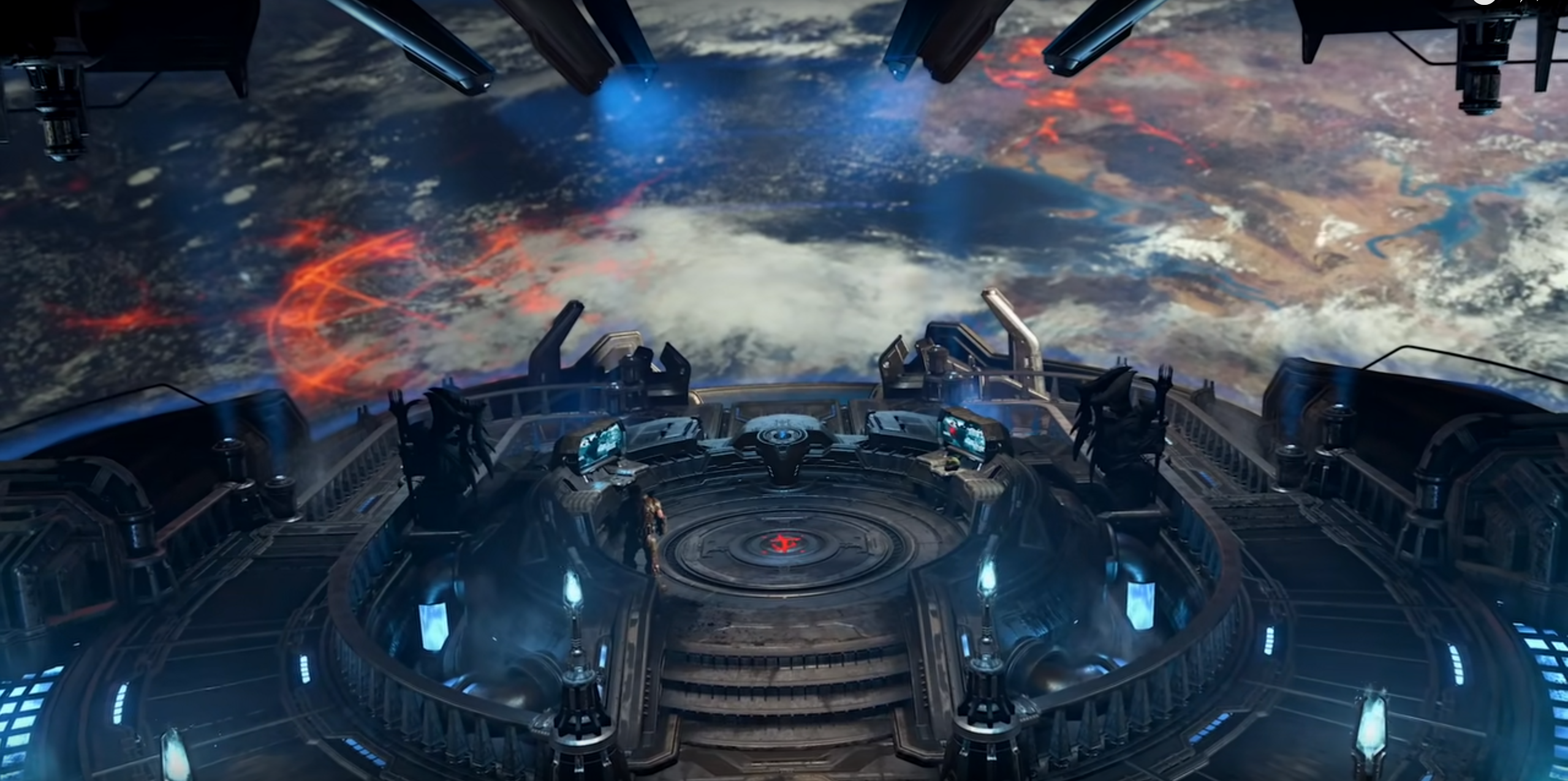
Consider an alternative layout and design for the spaceship bridge. Here’s the bridge for the Fortress of Doom from Doom: Eternal:

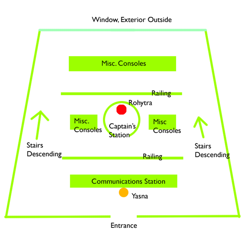
And here’s a possibly improved bridge layout based on the one from Doom: Eternal:

The muted colors of the walls and machinery in the Fortress of Doom keep them in the background. The window of the bridge dominates the screen due to the high ceiling and lowered floor. This would give us a better view of the alien robots’ habitats. You could have Rohytra at a captain’s console at a raised height in front of this window, thus layering him over the alien robots in Yasna’s view, juxtaposing the two threats. The console could surround him completely and he has to move in a circle to activate the warheads, so at certain moments we see his face and at others we see his back, and this could be an indicator of how successful (or not) Yasna is at convincing him to stand down. As each warhead is activated, have an announcement blare out over the speakers, amplifying the tension and giving a sense of progress to the player. The communications station is right in front of Yasna as she enters, so she never takes her eyes away from the alien robots or from Rohytra. The stairs that lead to the front of the bridge allows the player, if they wish, to get a closer look at the alien robots outside before starting the scene.
My proposed layout for the scene is hardly perfect of course, it’ll need testing to see if it really works and at a glance a potential concern is that it might still be too static for a scene of this length, but there is more focus on ensuring that the player’s view of the scene is visually interesting and that important information is conveyed. The Invincible in its current form uses its first person perspective lazily, almost as if it were a free pass to not have to worry about animating the camera during cutscenes. As Cyberpunk 2077 shows, this perspective would probably require more effort from the designer to ensure that the story is still told in a visually compelling way.